Tuesday, February 28, 2012

Blend Mode Play

Hi again.  I have been busy with retreats and sew ins and just now getting back to my Layers education.  I have been playing with blend modes and I think I am ready to move onto the next chapter. This will be the last post for chapter 2 of the "Layers" book.

This is a picture I took of the Wriggley building in Chicago and I thought the sky was a little deep in color for the whitenesse of the building.  I tried to follow the instructions for Matt's building/sky picture.  The issue with his picture was that the buildings were lighter than he wanted so he duplicated the picture onto another layer, applied the Multiply blend and then selected the sky and deleted the sky.


Original picture 
In my case when I followed his instructions the building appeared more gothic with harder edged windows and roof line.  I may not appear in a smaller size like at the right but full screen you see harder edges.  I have not learned how to use various selection tools to their best advantanges and what I do know it would have taken me a long time to remove the building.

So I thought I would test what I had learned so far.


I copied the original into another layer, isolated the sky using the magic wand selection tool and copied just the sky to another layer.  I now have 2 layers and a background.  I deleted the full picture copy and used the Screen blend mode to lighten the sky.  It is a little bright and the building looks pasted onto the sky.


I reduced the opacity of the sky to 60% and reduces the brightness of the sky so the building looks better.


The last exercise in chapter 2 Matt added a texture to a photograph to change the look of the photo.  Here is my try at it.  I have one of those clipart packages and found some textures to use.

This is a picture I took my first trip to Glacier Park.  An early morning shot of Lake McDonald.  I picked 8 textures to try over this picture.  Some were interesting, some didn't work.


#1
Overlay blend mode of the above sunburst

#2
Soft light blend mode of the above texture
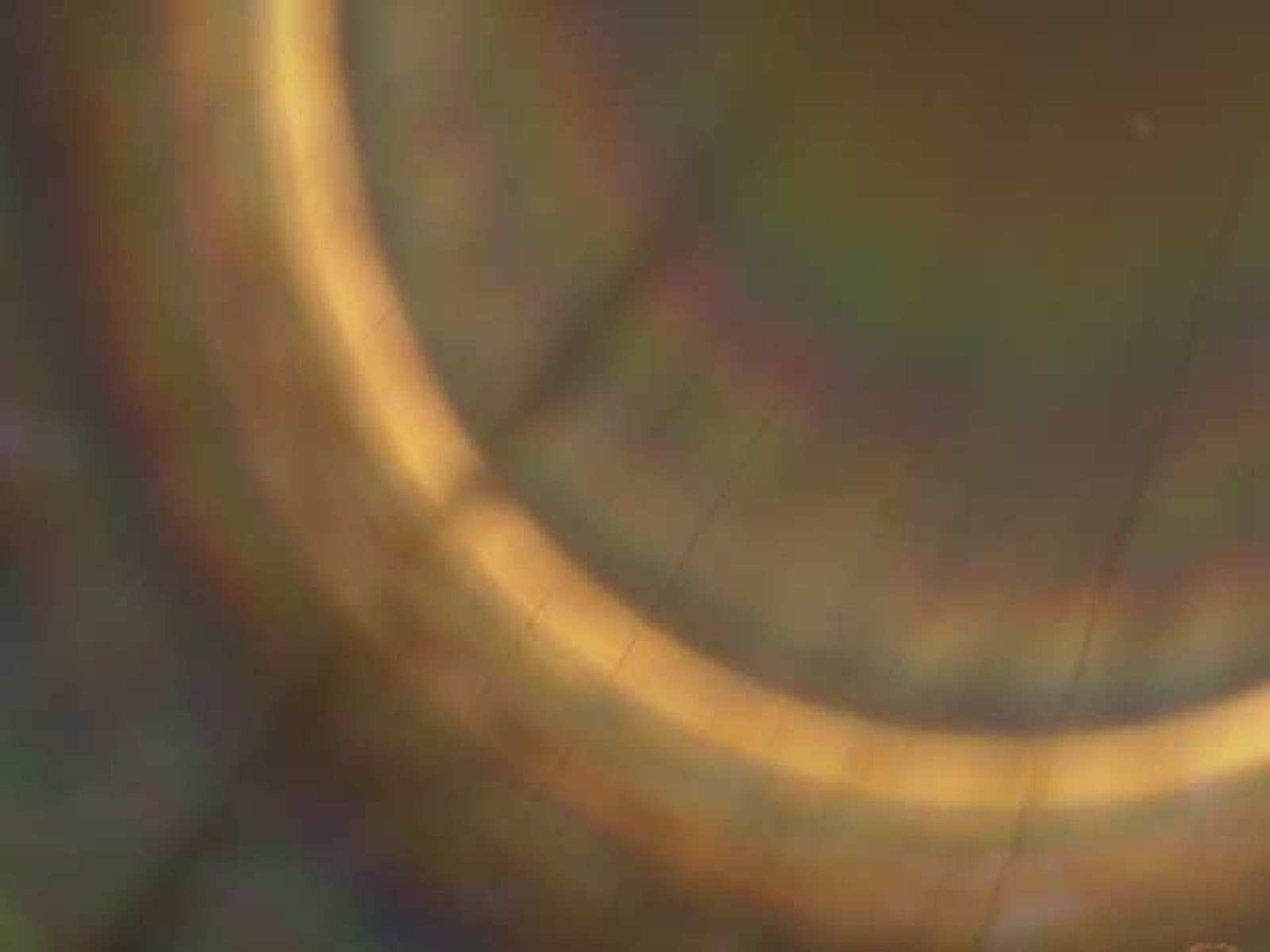
#3
Screen blend of the above texture then the opacity was reduced to 57%.

#4
I tried some other blend modes this one is exclusion of the above onion texture.  Gives the picture an odd negative quality.
#5
Soft light blend was added to the above texture.
#6
Those who know me know I like lace.  I saw this and just had to try it.  I used the color dodge blend mode.
#7

Hard mix blend mode gives quite the edge.

#8

Saturation gives almost a giraffe look to the picture.  Not my favorite as an allover for this picture.

I chapter 2 Matt introduces the eraser for the top layer of a blend mode.  I applied this technique to the next version of the Glacier picture.  Starting at the bottom of the picture I used the textures 7 in the water, 8 in the mountains, 6 allover, and 1 allover.   I started with each of the textures as a full layer then erased the parts not wanted.


#7 texture in the water with an overlay blend mode.  I erased the mountains and sky.


#8 texture was used in the mountains and over the water.  Opacity was reduced to 45%.  I erased the sky only.  I liked the effect it had in the water along with texture 7.

#6 was used allover with the soft light blend at 45% opacity.  No erasing was done with this texture or the next texture.


#1 was used to add more color and a ray effect with the overlay blend and 58% opacity.

Well, if you made it this far im my blend mode play, congradulations and thank you.  I have learned a lot so far and I look forward to continuing the journey.  I just may need to go on a photo outing to snap more picts.  


Thursday, February 2, 2012

Chapter 2 Blend Modes

This chapter may take a couple of posts to get through, so I ask for your patience.  Matt starts off in Chapter 2 with the 3 most used blend modes used in layers.  Matt explained that the blend mode list in the layers dock was divided into sections the first section deals with darkening effects.  The next section of the list is where you would choose a lightening effect.  The 3rd section of the list works with contrasts.  The 4th section will work with the differences in the differences of the layers.  And the 5th section works with color effects.  Matt had me bring in a picture.

This is the orginal picture.  The background layer.


I added a layer and filled it with a black to white gradient.  With the second or top most layer selected Matt had me apply the Muliply blend mode.


Multiply leaves the dark and dispenses the light.  In the picture you can see the black area of the gradient made the area of the picture directly below darker.  The blend graduates in color until the area below the white gradient is transparent.


The next blend mode Matt had me try was Screen.  It is in the lightening effects section of the list.

As you can see the opposite happened.  The area below the black section of the gradient layer is transparent and the section of the picture below the white area of the gradient is almost white.


The above examples he had me do to show extremes of the blend modes and not actually how to use them in a real edit of a picture.  The next set of pictures shows these 2 blend modes used for real and I was fascinated.

Again the original picture as the background.


He added a black and white logo, so I found this design in my stash.  The pick outline was added so you could see the edge of the design file.


I made sure the black and white design layer was selected.  Then I chose the Muliply blend mode and just like the Multiply example above the white became transparent.  I further rotated the design, reduced the size and copied and pasted more and nested them to cover the picture.  This was great fun and inspiring.
Next I used the same background layer and black and white design and applied the Screen blend mode.
I ran into a problem here as I started to rotate, copy, and paste.  The white corners overlapped the next designs and rows.  I had to open the black and white design on its own, then rotate it 45 degrees.  I cropped the design as close as possible.  The I copied and pasted it back into the background file.  The I could poceed as before with copy and past to make the allover design.  I then applied the Screen mode to black and white designs.
Here is a scrapbooky use of the Screen blend mode.
Here is mom again.  I will add a motif and the word Mom to her picture.
I created my own white font and motifs on black background in Corel Draw X5 and made a jpeg file to open in PhotoShop Elements.  I selected the capital M and copied it to a new layer, and did the same with the lower case o and m.  Now I have 3 new layers.  I selected the capital M and made larger and then selected the other letters one at a time and placed them next to the capital M how I wanted them.  I then selected the 3 letter layers in the layers dock and right clicked and selected Merge layers.  Now the 3 letters are now on 1 layer.  I selected one of the motifs and copied it.  Clicked on mom's picture tab and pasted the motif into mom's picture.  I clicked the black background with white lettering tab and selected Mom, copied it and pasted it onto mom's picture.  I played with placement until I was satisfied.
Now for the big finish.  I selected the motif layer and selected the Screen blend mode and did the same thing to Mom.
I admit these techniques are more crafty that photo editing, but I'm thinking printed fabric or giving words to my pictures.  More on blending modes in my next post. 

If you are in a creative block or at a crossroads ask the question "What would happen if I did...?" and do it.  Until next time.

lacyjayne2010