 PSE 9 version
 Corel Photo Paint
In the lesson Matt didn't cover lettering, but in Corel I added Jeep Man.
 The Background layer
I changed the background into a layer.
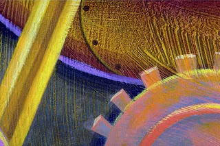
 This is the gradient layer that is under the background layer.
 This is the background with the gradient underneath. The background layer's opacity was reduced to 85%. When compaired with the original the center is slightly paler.
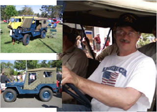 These are the 3 pictures, selected parts, and resized.
White frames were added to the pictures. In the book Matt added a layer above each picture's layer. This way there would be absolute control over the white frames.
In PSE9 there was a little automation. When I located the stroke function in the Edit menu it added the white frame to the same layer as the picture layer I had selected.
In Corel Photo Paint I couldn't find a stroke function so I used the rectangle tool and made a white rectangle just slightly larger that the picture I selected. This rectangle was represented in the layers list at the top of the list and covered the picture it was to frame. I moved the rectangle layer down the list to just under the picture's layer and now I had a frame.
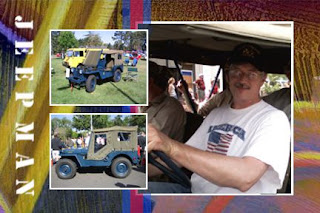 There were a couple of stripes added (the blue and red translucent stripes in the middle). Their respective layers were moved from the top of the list to just under all the pictures, but above the background layer. In the Corel Photo Paint version I added white Stencil font lettering to complete the composition. I hope my husband likes it.
The next Chapter in the book handles some blend modes. I look forward to it.
I am still learning about the page layout for this blog so I ask for your patience as it developes.
Until next time
lacyjayne2010
No comments:
Post a Comment